Wednesday, 16 January 2002

Coursework Production - Research

Quite a big range of examples of the type of media you are going to be producing
magazine covers music video links?
must find existing material that could fulfill the criteria, links to websites.
long lists of different codes and conventions.
don't stop looking, really think about it, spend time researching.
get loads of research, ten or so examples of magazines and contents pages, use of cell lines lighting shot type font layout, what message are they conveying, do the same for websites, at least three of the websites should come from the magazines below. original product and website and how they are connected together, convergence.


These are some of the results that come up when you search for entertainment magazines, the actual magazine, Entertainment, as shown above, mainly focuses on film and TV as a form of entertainment however they include music too. almost all of these include direct mode of address suggesting that it is a generic convention for this type of magazine. Look at their website. A series of mini articles all displayed on one page, including a title or headline, a sentence description and a picture.
My next search was 'What is an entertainment magazine?'
I had pretty similar results except the topics branched out slightly into fashion and music.


I then did a search for 'Magazines about entertainment', the first result was a list of "entertainment magazines".


  • Entertainment Weekly.
  • US Weekly.
  • TV Guide.
  • Rolling Stone.
  • The Hollywood
  • Reporter
  • The New Yorker
  • Variety.
  • People
  • Billboard


  • After some consideration I decided that the Billboard cover looked like how I pictured my magazine to be, I decided to gather more front covers and contents pages from that magazine, in order to see how they correlate. as you can see below they often use the same celebrity as on the front cover, inside on the contents page.

    Image result for billboard magazine covers and contentsImage result for billboard magazine covers and contents


    Image result for billboard magazine covers with contentsImage result for billboard magazine covers with contentsImage result for billboard magazine covers with contentsImage result for billboard front coversImage result for billboard front coversImage result for billboard front coversImage result for billboard front coversImage result for billboard front coversImage result for billboard front coversImage result for billboard contents pages billie eilish


    https://www.allyoucanread.com/top-10-entertainment-magazines/
    This is the website where I found a variety of entertainment magazines.


    Image result for entertainment magazine front covers with their contents pages


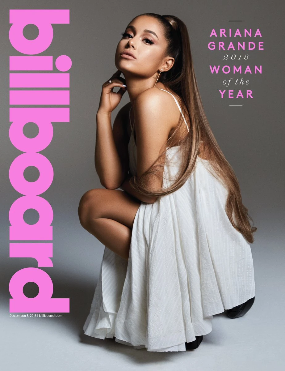
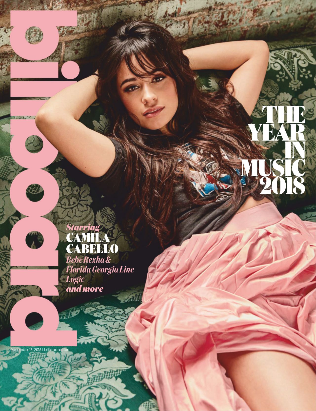
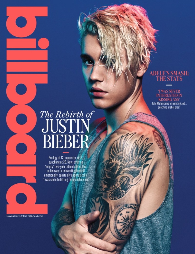
    Generic conventions of a entertainment magazine:

    • direct mode of address
    • bright colours 
    • plethora of font styles and sizes
    • lots of text
    • loud
    • quite a lot of half shadowed faces
    • mainly medium close ups or close ups, always the top half of the body, rarely long-shots with all of them in frame. 
    • contents pages tend to use wider or longer shots compared to the front cover.
    • they always include at least one 'celeb' name on the front cover, or a detail/ snippet, whether it be a quote or a title of an interview/article from inside the magazines.
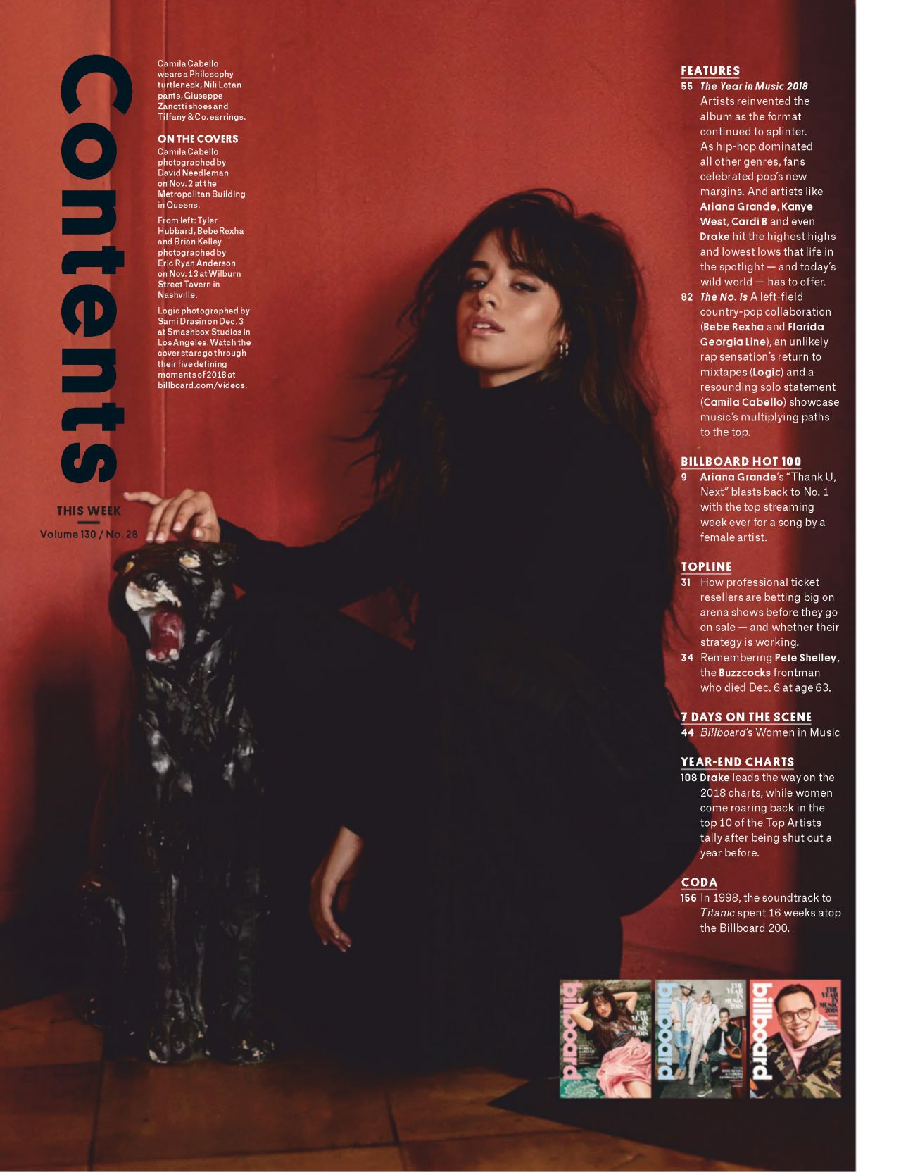
    • the actual contents are to one side of the picture, do not take up a lot of room on the page. Note: I particularly like Entertainment weekly's contents with Bella and Edward the contents is separated from the picture.
    • the contents will include a page number for the article as well as a title and short description of the article.
    • the title of the article will either be in bold, larger font, or a different colour to the short description of it.
    • with the picture there is normally a photographers name along the edge - not obvious or obstructing.
    • they all have a mast head which is usually in the same font but varies in size and colour depending on the issue.
    • most will have a bar-code.
    • most will have a date or issue number.
    • some have puffs which are used to promote things within the magazines.
    • there are always sell lines and cover lines, cover lines are bigger and the main attraction, usually the 'Celeb' name or small slogans - 'the heroes, the hits, the hair!' or 'bond gets his swagger back'
    • contents pages center more around the image, but include multiple sub headings 'chapters'.
    • the text in a context page is neat and to the side, very organised, unlike cell lines on the front which are put anywhere.
    • the background the text is on is usually plain so the text can be seen clearly, the main image with a plain background or the image is separate from the text.
    • contents pages have divisions on the page.
    I am interested in using an issue with a boxer on the front cover, in order for this to still fill the entertainment criteria I could pose it as a film about this sport. I think my main inspiration will come from total film and entertainment weekly magazine.


    Tuesday, 15 January 2002

    Coursework Production - Planning

    Post the briefs into blog
    Choose a brief
    Turn the brief into a series of bullet point instructions.

    advice
    needs to be something designed to get marks, should be useful to you, genuinely impact grade.
    mark out of 25 for production, based on how good it looks, does it appeal to the target audience.
    25 marks for website same thing
    10 marks for how they work together.

    maybe a short interview with your "celebrity".
    need mock ups of the magazine, mock up should look like the final magazine,  save file as a jpg.evidence of planning, draft version and final version.
    this is mock up number one it is a sports issue and the magazine is celebrity central so the sell lines should suggest variety within the magazine. this possibly needs another sell line positioned possibly near his shoulder.


    This was my first draft of my second mock up. the idea in this one is that she is an actress/dancer promoting her film again the focus is on her celebrity status therefore more diversity needs to be shown through the cell lines. this draft was also too square, unrealistic of a magazine cover which would be more of a rectangle shape.


    I have included generic conventions such as bar codes, dates and direct mode of address.
    I could improve by using more cell lines as is typical of an entertainment magazine, and include other small details such as the price, name of photographer and use of puffs, similarly to the contents pages.
    This will be the main layout for both of my contents pages I had inspiration from the cosmopolitan magazine the layout was similar to many others I had seen, much like some of the main covers they included puffs, and multiple separate sections, I've only included thee sections, but will include more with the real thing, I will also do it across a double page spread and include a bigger main image, more use of colour and bold, italic, underlined, techniques. For this draft of the contents pages I wanted a bit of everything, to show at least one of each of the main contents magazines generic conventions, a snippet from each convention I will be using. 
    I have decided that the main image I use for each front cover will be a still image, medium close up, of the main 'celebrity' feature and for at least two of the other three images I must include (according to the brief, which states I must use four original photographs) the image will be an action shot of this 'celebrity', and will be situated in the contents pages. The front cover will consist of one main image, central to the frame, with multiple sell lines surrounding, in a variety of sizes and a minimum of three sell lines will be present on the cover, a colour scheme will be clear and present to the front cover through the sell lines, some sell lines will be in puffs, probably include two, font will be the same unless it is to attract attention toward a name or certain brand, in which it would be beneficial to change the font, a plain background, possibly gradient of two colours, but nothing to distract from the main image. A bar-code will be present as well as the date and/or issue number. The contents will be labelled clearly and most likely across a double page spread, the background will most likely be white or another plain bland colour such as beige in which it is easy to be able to see the text which will include a variety of colours, and similar to the front cover clearly present the magazines main branded colour, subheadings and descriptions of articles will be easily distinguished between due to an obvious difference in their size, page numbers will be to the left of the text and will also have a distinguishable size difference and finally there will also be some articles in puffs, as with the front cover. I will include a rough second mock up demonstrating this change.


    Saturday, 12 January 2002

    Course work Statemnet of Intent

    Statement of intent

    How do you intend to use the four areas of the media theoretical framework to communicate meaning and meet the requirements of your chosen brief? (approx. 400 words)


    The target audience for my magazines are 16-25-year-old with a fun-loving deposition, as indicated by the course brief. I asked a focus group of this demographic what they thought about current entertainment magazines and found that the generic conventions were appealing to them. Things such as the use of close ups and direct mode of address from the models on the cover. I took this into account when designing my own front covers. I collected a wide range of entertainment front covers to aid me with this. My research into entertainment magazine shows a wide range of these conventions. Entertainment magazines are usually focused around the celebrity they choose to use on their cover, and the sell lines support this as well as giving the readers a sneak peek into what else their readers can expect to find inside. Therefore, I will aim to focus on the subject of the picture and ensure that it is the main focus of the cover and that the sell lines support this. While focusing on entertainment I will also be addressing ideologically based issues that my audience have identified as ‘concerns’. I will be including aspects of diversity to allow me to fulfil the brief 'At least two models representing at least two different social groups.' For example, I will have a male athlete on the cover of the film edition, however the focus will be on the boxing gloves and his eyes rather than his body. On my second cover I will include two females, I believe my target audience will be able to relate to them as I plan to have them posed having fun and looking confident. Both my covers will feature close ups with direct mode of address to emphasise their connection to the reader. My focus will be on attracting young adults of a 'fun-loving' nature as the brief states. In order to produce this, I must have up to date knowledge of pop-culture. My focus group have said that they would like to see a range of different stories that don’t just concern TV and Film so as well as showing this on the front cover I will include a wide range of examples in my magazine contents pages. 

    My website will have similar ideas to my magazine to show a convergence between the two platforms but will include further information and features that would be exclusive to online media, such as the use of video. I aim to engage with the target audience to give them representations they feel they can identify with and so I intend to include an interview either in short text form or video form, to help the audience connect with the ‘celebrities’ on the cover. Through my website research I have noticed that the websites are noticeably blander than the magazine covers and often have a plain white background with a main colour, which reoccurs throughout the website. I intend to subvert this convention, I intend to have a clear theme colour throughout the website and the magazines, however use a backdrop on the website which does not distract from the information on the page but makes the site look more appealing to a ‘fun-loving’ audience.

    For the audio-visual element, I intend to produce a behind the scenes video of our photo shoots for the cover of one of my magazines. I will betaking inspiration from a Wonderland magazine video using still images from the shoot as well as footage I will take whilst taking the photos. 


    How do you intend to link your media products to demonstrate your knowledge and understanding of the digitally convergent nature of your media production? (approx. 100 words)

    I intend to demonstrate my knowledge and understanding of the digitally convergent nature of my media production by conforming to a consistent House Style across the magazines and the website. The masthead will be representative of the house style using a colour schemes and fonts, as well as a logo, which will be seen on each of the products I produce. As well as including extra articles on the website I will also include pictures an, videos and stories mentioned in the magazines to demonstrate a convergence. I intend to use the same models throughout and use a mixture of studio taken photos and location taken photos, so as to fulfil the brief which states that I must include 'a different setting for each cover' as a minimum. I will feature elements like interviews with the models featured in the magazines and wider range of images of the same models so that there is a clear cross-over between the two texts. The company logo for Hearst will be on each magazine, unobtrusive and on the bar code as stated in the brief. 


    Friday, 11 January 2002

    Brief

    https://www.ocr.org.uk/Images/465770-unit-h409-03-04-a-level-media-studies-making-media-nea-briefs-june-2020.pdf

    Medium Requirements of the brief Production detail
    Brief 3
    Magazines and online
    You work for an independent media production company. You have been given the task of producing
    one front cover and the contents page(s) of the first two editions of a new entertainment magazine
    that is being launched by Hearst Magazines UK and the working website for magazine.

    Contents pages can be either single or double page spread.

    The web pages must promote the new magazine to its target audience and enable fans to interact with the content. Summary of brief requirements:
    • Statement of Intent (approx. 500 words)1
    • Entertainment magazine covers and contents pages: two or three pages for each of the first two editions (based on choice of single or double page spread).
    • Magazine distribution method: Content must be suitable for retail distribution.
    • Number of web pages: One homepage and one linked page.
    • Cross-media production target audience: a fun-loving 16–25 year old mass market demographic.

    There must be a clear sense of branding across the two elements of the cross-media production. The production of the magazine covers and contents pages must include (as a minimum):

    • At least four different main images using original photography across the covers and contents pages.
    • Editing of magazine covers and contents pages (including photos, text, graphics, typography and layout). 
    • Written text including masthead, main coverline, selling lines, headlines, captions, subtitles and copy.
    • A different setting for each cover (this may be the same location with a significantly different use of staging, mise-en-scene and / or lighting).
    • Different material for each magazine’s contents page(s). 
    • At least two models representing at least two different social groups across the magazine covers and contents pages. 
    • A call to action pointing readers to the online website.


    The production of the web pages must include (as a minimum):

    • Original audio or audio-visual content appropriate to the online website. 
    • A minimum of two original  images, (with at least one different original image on each of the two pages) that promotes and reinforces the brand identity of the magazine. 
    • Appropriate conventions of website design, including an original title and logo for the magazine and a menu bar. 
    • Text introducing the main features of the magazine. 
    • Working links from the home page to the other page. 
    • A range of appropriate media language techniques (typography, images, fonts, backgrounds, logos etc.) as appropriate to the purpose of the website.


    1 A Statement of Intent document needs to be completed as part of each OCR set brief. Learners need
    to complete a Statement of Intent document to outline the ways in which they propose to use the four
    areas of the media theoretical framework to communicate meaning and meet the requirements of their
    chosen set brief.

    Thursday, 10 January 2002

    Teachers Comments

    LAYOUT AND DESIGN - MAGAZINE COVERS
    I particularly like your covers, and am suitably amused by your obsession with Mazerunner. Your covers are genuinely convincing and you have demonstrated a clear understanding for layout and design as well as a sense of cohesive house style. The contents pages are too sparse to be convincing, especially given that you shoes to produce a double page spread. When we get to the real thing, consider more close and careful research into generic features.

    Well done, especially for the covers.


    Layout and Design Task

    Brief: Create mockups for the front cover and contents pages of two issues of the same fashion magazine aimed at a sophisticated target aud...